Client
The Peculiar Tea Company
Our Role
Brand Identity
Brand Application
Industry
Packaging
Location
London, UK
The Peculiar Tea Company is a conceptual branding project exploring what a modern British tea brand could look like with a little more personality.
Taking inspiration from the quintessentially British ritual of drinking tea, we set out to create a brand that felt playful, full of character and unmistakably different from the more traditional aesthetics commonly found on tea shelves.
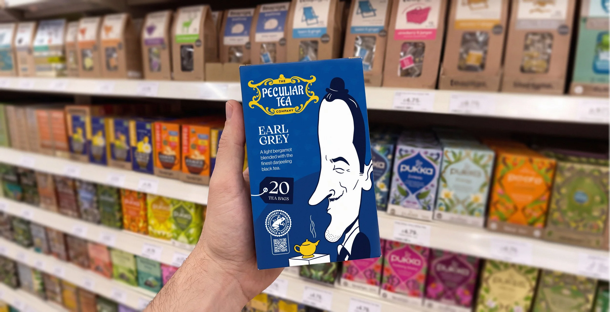
The Project
Tea is about as British as it gets, but much of the branding in the sector can feel surprisingly repetitive. Floral patterns, botanical illustrations and heritage-inspired designs dominate the industry.
We wanted to design something a little more quirky to match the company name.
We focused on:
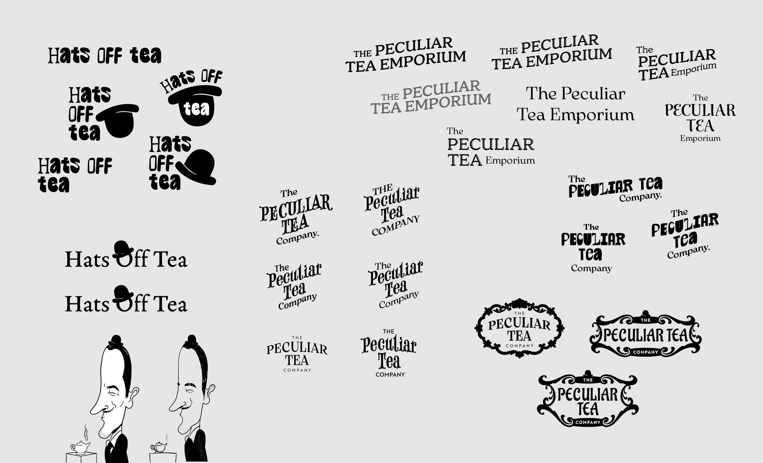
• Developing a quirky logo to match the brand name
• Colourful and playful artwork
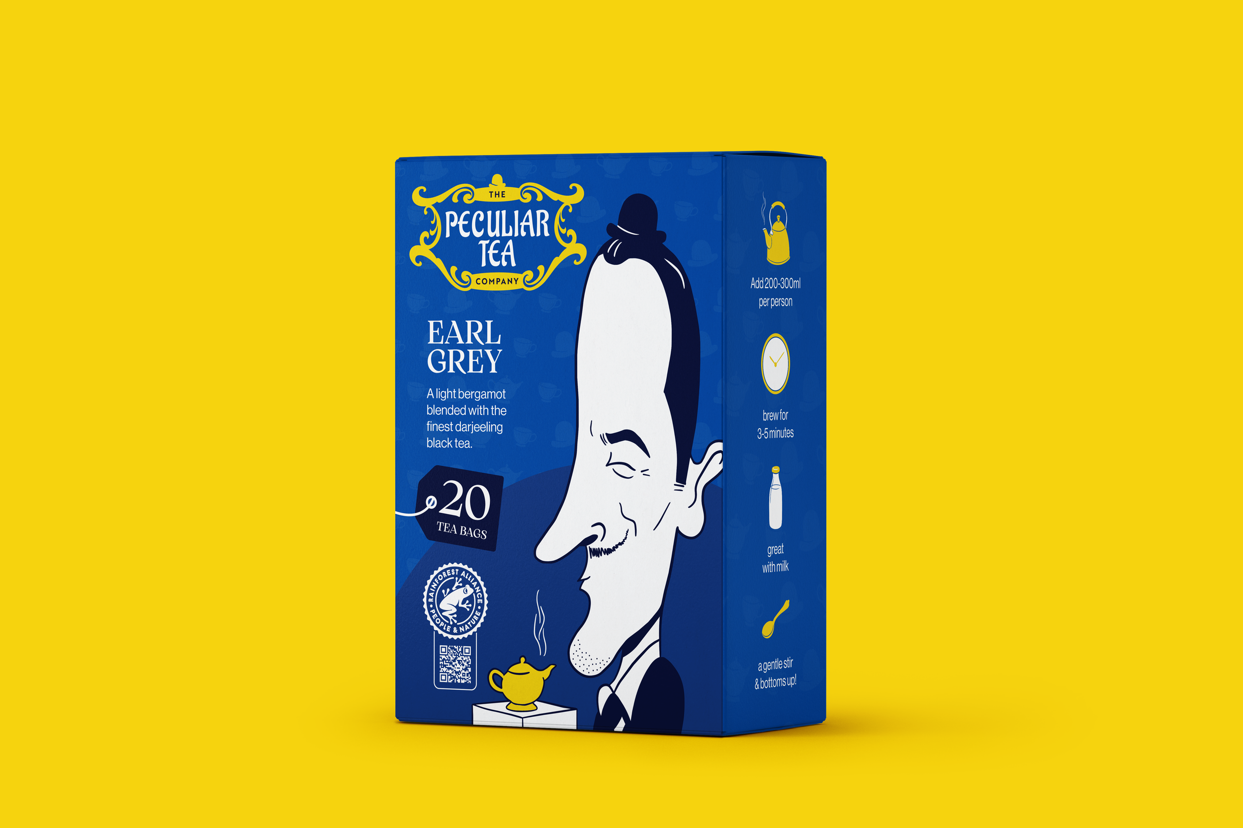
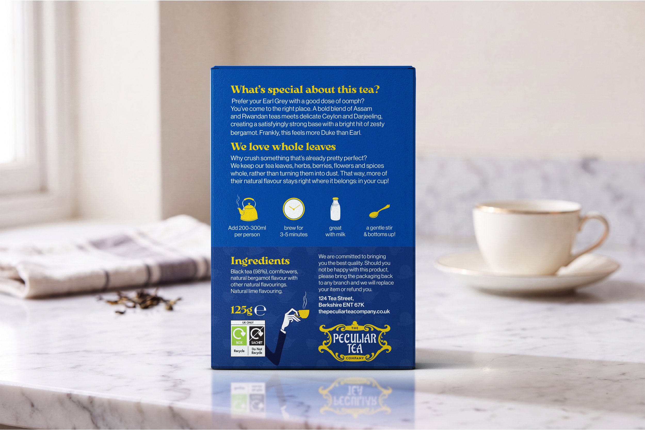
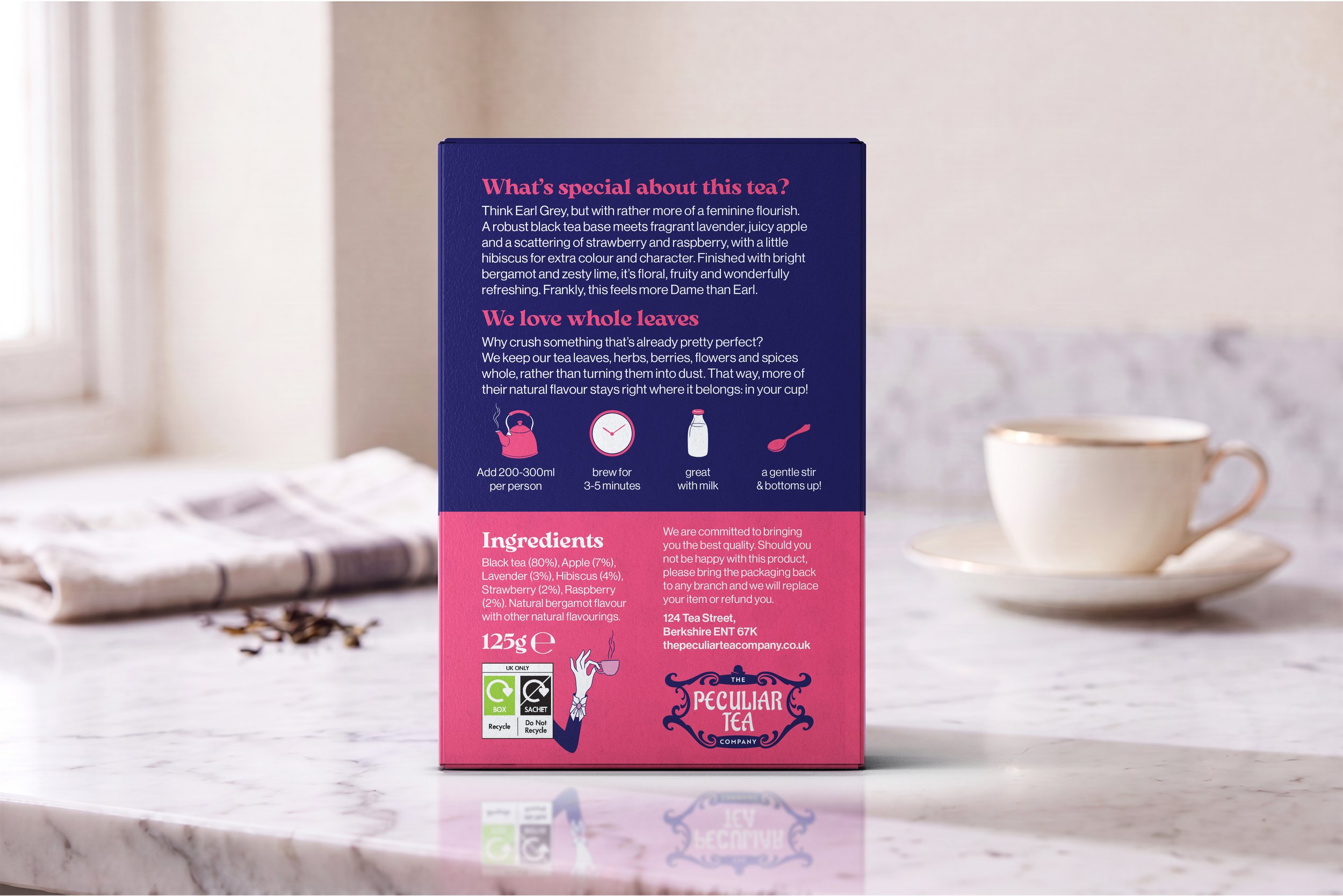
• Packaging design so that our creation would stand out on a shelf!
The Solution
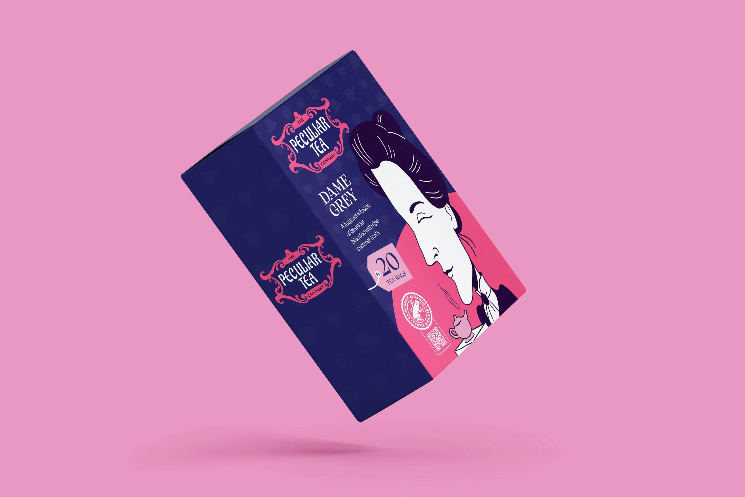
Rather than leaning into the familiar designs we usually see on supermarket shelves, we explored how exaggerated illustrations, bold colour and eccentricity could create a brand with its own distinctive and playful personality.
The illustrations of our Earl and Dame Grey became a central part of the brand identity, without relying on the more predictable imagery associated with tea.
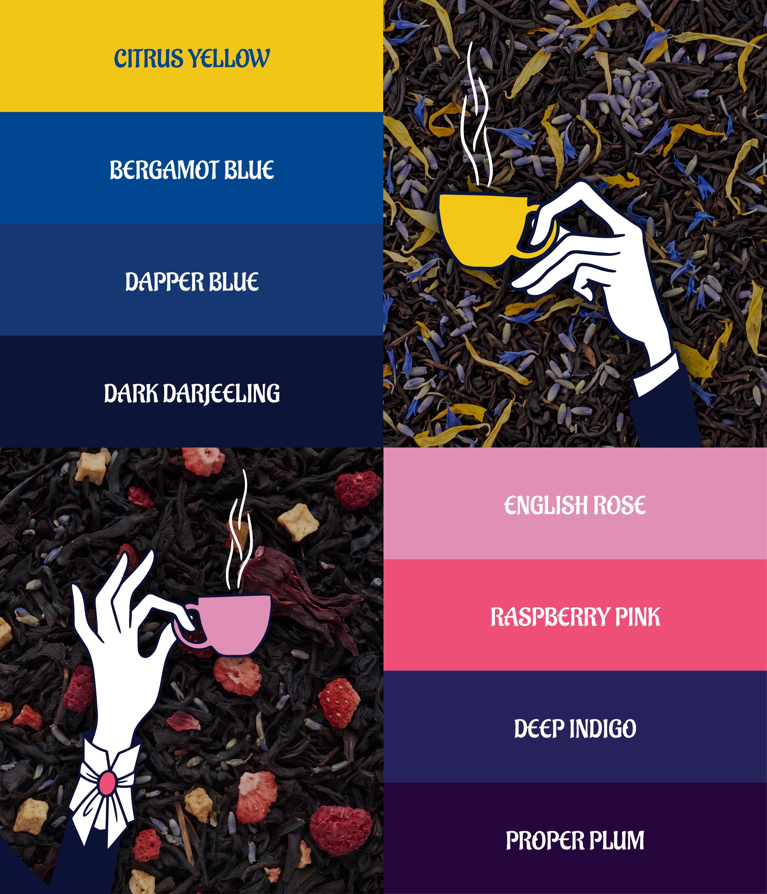
We came up with a bold colour palette to complement the character-led artwork and give each tea its own "look and feel", while typography was kept simple.